Skip to main
University-wide Navigation

View the individual dashboard

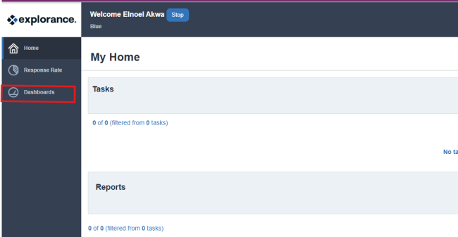
The individual dashboard is the self-viewed dashboard for an individual within the organization. The responses displayed in this dashboard belong to this individual directly, for example all of the courses taught by this instructor, and this dashboard can only be viewed by this individual.

The individual dashboard empowers users with an independent analysis tool they can use to identify meaningful continuous improvement opportunities.

A PDF version of this guide will be made available.

Notes

Questions- At this time only the TCE Standard questions are imported to the dashboard.

Question group - A question group is a group of Dashboard Questions that focus on a single central theme, such as courses, instructors, course organization or quality of learning. Data can be spread across a number of projects, over a period of time, and among various subjects, but ultimately the resulting data is presented together to provide valuable insights.

Time scale - represent the academic periods used in our evaluation system. At UK, these are defined as:

  • Fall: August - December
  • Spring: January - May
  • Summer: May - August
  • Winter: December - January

Threshold - In an effort to ensure that specific feedback cannot be traced back to a specific user, minimum response threshold of 5 have been created for both subjects, and respondent demographic data.


Dashboard landing page

  1. Navigate to Blue at https://evaluate.uky.edu/Blue/
  2. Log in with your LinkBlue credentials
  3. Click 'Dashboard' on the left navigation panel 


log in dashboard

📊 Available Data Range

The dashboard contains your evaluation data from Fall 2017 through Summer 2025, covering all courses and sections you've taught during this period.

Individual dashboard header section


header


a.  Follow the breadcrumb to easily find where you are in the dashboard.

b. Select the (i) icon to display the legend information.

c. Pop-out the Dashboard in a new tab or window.

d. Edit the settings menu to customize the dashboard to your liking, select statistics to display, change the order of the views.

e. Export the individual dashboard raw response data in a set of CSV files which can be used in third party analytics tools.

f. Switch between the available views.

Dashboard controls Dashboard controls b Dashboard controls c

Dashboard controls

  1.  
    1. Switch between the available views.
    2. Anchor time period - Use the left or right arrow buttons to move the selected time period (i.e. anchor time period that is highlighted on the chart) or jump to a specific time period by clicking the current time period and jump to the new time period.
    3. Time range - (Trend analysis view only) Adjust the time periods being displayed. All data within this time range will be included in the trend charts. A maximum of nine time periods can be selected within a time range.
      1. Time scale - Multiple time scales can be utilized by the dashboard (i.e. year based time periods, or semester based time periods).
      2. Time range drop-down - Time periods can be selected or excluded and then Apply must be clicked to update the dashboard.
      3. Time range selection - The user can move the time range forwards and backwards and the range will adjust when you click Apply. Use the mouse to select or deselect a time period. The dashboard is refreshed each time the range is updated.
    4. Compare with - To further discover the hidden insights in the data, the compare feature allows a user to slice and dice the data based upon selected demographic criteria that they want to examine in more detail or measure against a larger entity (i.e. department).

      Users can take advantage of the Select all option to choose all available items within a demographic field to include them in the comparison.

      1. My data:
        1. Select demographic criteria to breakdown the data set, then click Apply to proceed.
        2. Please note, the subject names are automatically listed and grouped alphabetically in the comparison criteria
      2.  Pre-calculated norms: Works just like my data but allows a user to measure their results with a larger entity like a school or department.

        Note

        • To address data privilege concerns, the norm elements that are available are dynamically determined based on the loaded dataset. For instance, to view the department norm for biology, you must have at least one course that belongs to the biology department.
        • Pre-calculated norms remain unchanged by filter criteria.
      3. Pre-calculated percentiles: Allows users to benchmark themselves against specific percentiles of a school norm instead of just comparing with the school average.

        For example, users can determine where they rank among other in the organization. For example, better than 75% of people in their school, even if their score is already above the school average. This addition adds a more nuanced understanding of performance within the context of the larger group.

        Note: Pre-calculated percentile is calculated based on the concept of norm across subjects.